Addi Fowler, Maya El-Lakany, Nicole Campbell & Skye Rohani
For our multimedia undertaking, we directed our attention towards the thematic exploration of trees. The impetus behind this selection was grounded in the profound expertise of one of our group members, coupled with a shared interest among the team. Significantly, Maya had previously curated an instructive lesson on trees for her Module 4 blog. Building upon this groundwork, we collectively resolved to delve more profoundly into the subject, elevating her initial lesson into a dynamic video and extending it into a comprehensive project.
To start off, we created a lesson plan following the techniques we had learned through Module 4:
Lesson Plan:
Overview
This week, students will be learning about trees. They are essential for maintaining the balance of oxygen and carbon dioxide in the atmosphere, providing habitats for various species, preventing soil erosion, and providing resources crucial for human survival and well-being. Trees are part of the science curriculum and are required by the British Columbia Grade 3 curriculum. Last week students learned about plants, providing a basis as to what trees are and their importance. Next week students will learn about the environment, which trees are an important member of.
Lesson Objectives
By the end of the lesson:
- Learners will be able to identify the different parts of a tree.
- Learners will be able to name the different types of trees.
- Learners will be able to identify trees in nature.
- Learners will understand the importance of trees on our planet and in our ecosystem.
Read/Watch
Students can watch this video and read “The Busy Tree” by Jennifer Ward if they would like extra information on our lesson.
Content
- The teacher will review the different parts of a tree by showing a real example.
- The teacher will explain the two types of trees.
- The teacher will explain how trees provide oxygen and how this affects people and the planet.
- The teacher will explain how leaves, wood, and food are harvested from trees to provide humans with resources.
- The teacher will explain how animals use trees for homes and food.
Application
Students will complete both H5P learning activities (Structure of a Tree and Word Search) to test their knowledge of the topics.
Students and teachers will walk around the school grounds and identify trees as well as each type.
Students and teachers will walk around the school and identify where and how trees are being used (food, wood, etc.).
Reflection
Students discuss their findings from home the following day with 2-3 other students and they will answer the following questions in their group:
- What was the most surprising find?
- How do you think trees affect your life day to day?
- What types of trees did you see around your home? Why do you think this is?
Afterwards the teacher will lead a classroom discussion on their findings.
To Do This Week
- Watch the video “Trees for Kids” (extra)
- Read the book “The Busy Tree” by Jennifer Ward (extra)
- Complete H5P activity: Word Search
- Complete worksheet activity: Structure of a Tree
- Identify three ways trees are used in and around your home
- Have a discussion with a group of 3-4 student
Following this, Nicole designed a story board and script based on the things we wanted to teach/showcase in our video.
Storyboard/ Script:
The creation of this script and storyboard involved a thorough examination of previous module readings, media resources, multimedia materials, blog posts, and assignments. Our decision to focus on the topic of “trees,” a subject previously explored by Maya in Modules 1 and 4, significantly streamlined our workflow. In Module 1: Theories of Multimedia Learning, Maya diligently outlined the pre-storyboarding principles considered in our storyboard:
Storyboarding encompasses a wide range of intricacies, serving as an essential guide throughout the video production and editing processes. This specific storyboard places a strong emphasis on detail, incorporating elements such as on-screen text, photos, and narration to facilitate the filming of the script. Our storyboarding process is informed by a collection of Mayer’s Principles, including:
- Limited Capacity (Cognitive Load Theory): Mayer’s theory recognizes the limitations of learners’ cognitive capacity and addresses the challenges posed by cognitive load (Mayer, 2012). This storyboard meticulously manages the script to prevent overload and maintain information efficiency.
- Dual Coding Theory: Mayer’s CTML acknowledges the effectiveness of integrating both visual and verbal information, aligning with the core principles of dual coding (Mayer, 2012). The storyboard seamlessly incorporates both narrative elements and visual components, in accordance with Mayer’s Dual Coding Theory.
- Active Processing: Mayer underscores the significance of active processing, emphasizing that we develop cohesive mental representations by actively filtering, selecting, organizing, and integrating information (Mayer, 2012). The organization of this storyboard follows a coherent sequence for the integration of each point. This deliberate engagement stimulates the audience to engage in profound reflection on the speech’s content, encouraging them to contemplate their responses. As a result, it amplifies their attention and deepens their comprehension.
- Extraneous Cognitive Load: This storyboard adheres to the coherence principle by consistently staying on topic and including only relevant information in the table of contents.
- Intrinsic Cognitive Load: The process of pretraining lays a solid foundation for group members to facilitate a smooth filming process. To manage intrinsic cognitive load effectively, I adopted a meticulous approach to segmentation. Our storyboard is presented in a structured table format comprising nine sections, ensuring concise textual content. By proceeding with this storyboard, we aim to adhere to the modality principle, voice principle, and image principle. This will involve human narration of the storyboard and script, complemented by visual elements. Notably, our emphasis on social cues, characterized by polite and natural speech, exemplifies the application of the Personalization Principle.
- Germane Cognitive Load: This storyboard equips the filming team to maintain a clear script devoid of unnecessary information, thereby minimizing germane cognitive load.
By integrating Mayer’s Principles in our storyboard, we aim to create an inclusive learning environment that enhances support and flexibility to meet the diverse needs of all learners.
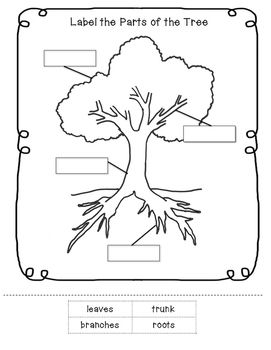
Additionally to our storyboard, we also created an HP5 activity for our users, as well as a worksheet just to add in some supplemental activities.
HP5 Word Search
Tree Worksheet
Following our storyboard, we began to put everything together. Skye and Maya spent some time out in nature filming the lesson and putting all of the pieces together, and Addi spent the time editing in the correct order and adding the text and captions to the screen. After all of the steps together, we came to our final product.
Our Multimedia Lesson Video:
Group Reflection
The decision to center our lesson around the theme of “trees” was intentional. Recognizing that trees are a universal and vital aspect of our environment, we aimed to create content that would resonate with a diverse audience. By choosing a topic with broad appeal, we sought to ensure that our lesson would be inclusive, catering to a wide range of learners with different interests and backgrounds. Inclusivity, for us, was not just about accessibility but also about crafting content that could engage and captivate learners from various perspectives.
Our approach to developing the storyboard and script was deeply rooted in Mayer’s principles of multimedia learning. The attention to cognitive load, dual coding theory, and active processing was not just an academic exercise but a deliberate effort to create a learning experience that aligns with evidence-based practices. For instance, considering the limited capacity of learners, we structured the script to prevent overload while maintaining information efficiency. The incorporation of visual and verbal elements, in line with dual coding theory, aimed to provide a well-rounded learning experience. By emphasizing active processing, we intended to stimulate our audience to engage deeply with the content, encouraging reflection and comprehension.
Although small, the decision to integrate H5P activities, particularly the Word Search, was a conscious choice to add an interactive layer to our lesson. This went beyond merely following a trend; it was about recognizing the diverse learning styles of our audience. As we have learned through this process – interactive elements have the potential to engage learners actively, making the learning experience more dynamic and participatory. In doing so, we not only adhered to Mayer’s principles but also responded to the evolving landscape of educational technology and its impact on engagement. The addition of the Tree Worksheet as a supplemental activity was driven by a recognition of the diverse needs of learners. While our video and H5P activities served as primary engagement tools, the worksheet offered an alternative avenue for learners who may benefit from additional resources or approaches. It was about acknowledging that learners have different preferences and learning styles, and our aim was to provide a range of resources to accommodate those differences.
Taking our lesson outdoors, filming in nature, and encouraging students to explore trees in their surroundings was more than a logistical decision—it was an educational one. We believed that connecting educational content with real-world experiences could profoundly impact understanding. The decision to step out of the traditional classroom setting aimed to make the learning experience more authentic and relatable. It was about creating a connection between the lesson content and the world around us, fostering a deeper appreciation for the subject matter.
The collaborative efforts in the filming and editing processes were a testament to the strength of teamwork. Each team member brought a unique set of skills and perspectives to the project, enriching the final product. The collaborative process was not without its challenges, but it reinforced the idea that diverse skills and viewpoints contribute to a more comprehensive and well-rounded outcome. It was about leveraging our collective strengths to create a multimedia lesson that was greater than the sum of its parts.
In conclusion, our multimedia lesson on trees was not just a project; it was a deliberate and thoughtful endeavour to create an inclusive, engaging, and impactful learning experience. It was about more than just delivering information; it was about crafting an educational journey that resonated with learners on various levels, aligning with both established educational principles and the evolving landscape of educational technology.
References
Mayer, R. E. (2012). Principles of Multimedia Learning. Digital Learning Institute. https://www.digitallearninginstitute.com/blog/mayers-principles-multimedia-learning/
Weber, Lillian M. , Everett, Thomas H. and Berlyn, Graeme Pierce. “tree”. Encyclopedia Britannica, 24 Oct. 2023, https://www.britannica.com/plant/tree. Accessed 5 November 2023.
Cazzolla Gatti, Roberto, et al. “The number of tree species on Earth.” Proceedings of the National Academy of Sciences 119.6 (2022): e2115329119.
Butler, R. A. (2022, March 14). Types of Forests: Definitions, Examples, and More. Treehugger. https://www.treehugger.com/types-of-forests-definitions-examples-5180645#:~:text=Boreal%20forests%2C%20found%20farthest%20north,harbor%20incredible%20amounts%20of%20biodiversity
Image 1: https://images.app.goo.gl/KqWqns1N3pyhU5kH6
Image 2: https://images.app.goo.gl/jZTGwriuJsaJZVxC7
Image 3: https://images.app.goo.gl/WdjeuSYuoL1F5k5r5
Image 4: https://images.app.goo.gl/RgccprCpYuHzmFKv6
Image 5: https://images.app.goo.gl/xM6hcTheEcr7yAru9
Image 6: https://images.app.goo.gl/ZZSft1LPemUjSrPGA
Image 7: https://images.app.goo.gl/zrk5zd6oqkS7fmVw6
Image 8: https://images.app.goo.gl/BVqF1cp353oeZjUt5
Image 9: https://images.app.goo.gl/LdWquY9dSGr78TKd9
Image 10: https://images.app.goo.gl/HgqJHbWAbNRmv9bF8
Image 11: https://images.app.goo.gl/Q2hmXyBA1rvUefsg6
Image 12: https://images.app.goo.gl/W5acF93dLq4NSBWF8
Image 13: https://images.app.goo.gl/JHLqrQmLDzxrNyw8A
Image 14: https://images.app.goo.gl/4BMwepHEx6gkfbNB7

Recent Comments