In this module, I enjoyed exploring design principles for effective and accessible multimedia, and it was a truly enjoyable experience. This module allowed me to delve into the world of accessibility in design, unveiling the hidden complexities of living with a disability. As I currently work with kids with a wide variety of abilities, I am always looking for new ways to broaden my awareness of the intricate challenges that people with disabilities face regularly.
Furthermore, this module provided insights into creating effective PowerPoints and infographics. As someone naturally inclined toward creativity, the guidelines for crafting multimedia content boosted my confidence and allowed me to refine and practice my skills. It served as a platform to further hone my creative abilities and enhance my prowess in producing engaging and impactful visual materials.
My journey through Module 2 not only deepened my understanding of accessibility and its importance but also provided me with valuable tools to enhance my multimedia creation skills. It underscores the transformative potential of education in expanding horizons and empowering individuals to leverage their inherent creativity for the benefit of all.
Reflection Questions
What did you find when you ran the WAVE accessibility report on your blog post(s)? What did you expect, and what was surprising? Is there anything you will do differently going forward?
Running a WAVE accessibility report on your learning materials can be an eye-opening experience. It’s incredible how seemingly minor design choices can profoundly impact accessibility. The surprise often comes when you see just how many areas need improvement, such as contrast issues or missing alt text for images. It reinforces the importance of considering accessibility from the outset of the design process and not as an afterthought. I found that my site did indeed have accessibility issues, which I was surprised by as this was not something that I had thought about while writing my blog posts. What struck me the most was how small oversights, like insufficient contrast or missing alt text, can inadvertently exclude learners. It’s a reminder that accessibility isn’t an optional feature but an essential aspect of creating equitable learning experiences. Going forward, I’d make it a priority to ensure that my materials are not only visually engaging but also inclusive and accessible to all learners.
I’ve found text-to-speech tools to be quite valuable for individuals with visual impairments and for various learning styles. Trying out different voices highlights the significance of voice quality and pacing in facilitating information absorption. Observing how the narrator’s voice can affect the learning experience is fascinating. I tried out multiple voices, from Snoop Dog to robots, which made me reflect on how technology can bridge accessibility gaps and cater to various learning styles. It’s a testament to the power of inclusive design to make education more accessible and enjoyable.
Have you used Text to Speech tools before? Did you find it useful? Did you try out some of the different voices? What impact did the different voices have on your ability to absorb information?
The role of media and multimedia in a Universal Design for Learning (UDL) framework is profound. They provide multiple means of representation, engagement, and expression, making learning more flexible and personalized. What’s particularly intriguing is how practices for creating accessible text, images, and video align seamlessly with UDL principles. It underscores the idea that good design and accessibility often go hand in hand, ensuring learners of all abilities can access and engage with content effectively. It’s a reminder that education should be adaptable, embracing the diversity of learners. When used thoughtfully, media and multimedia provide avenues for customization and engagement. I personally greatly appreciate video captions, as they enable me to comprehend individuals speaking with accents I’m not accustomed to, and also help me with word spellings and allow me to keep up on anything I might miss. What strikes me as particularly powerful is how the best practices for creating accessible media align seamlessly with UDL principles. UDL encourages presenting information in multiple ways to cater to diverse learning styles and acessible media, such as captioned videos, audio descriptions, and transcripts, provide alternative ways to access content beyond traditional visuals and audio. This benefits not only individuals with disabilities but also those who prefer different learning modalities. It reinforces the idea that designing for accessibility isn’t an extra step; it’s an integral part of making our lessons and designs.
What does inclusive design mean to you?
Inclusive design is more than a set of guidelines; it’s a philosophy that shapes how we approach education. It means creating a learning environment where every student feels valued and empowered. It’s about recognizing that diversity isn’t a challenge to overcome but a rich tapestry that enhances the educational experience. Inclusivity, to me, embodies the essence of equity and reminds us that our role as educators is to provide opportunities for all learners to thrive.
What do you think the presentations in The World’s Worst Powerpoint Presentations have in common? Which design principles and which other principles (Mayer’s, Inclusive Design, UDL) are they missing?
The humour in “The World’s Worst PowerPoint Presentations” is undeniable but also a moving lesson. These presentations highlight how easily design choices can lead to disengagement and confusion. These presentations tend to be cluttered with excessive text, graphics, and animations. They lack the design principles of simplicity and minimalism. Inclusive Design principles are also overlooked, as a cluttered slide can overwhelm some viewers, including those with cognitive or attention-related disabilities. Overall, these poorly designed presentations often share characteristics such as clutter, inconsistency, excessive text, and a lack of engagement. They tend to neglect design principles like simplicity, consistency, and visual hierarchy, as well as educational principles such as Mayer’s principles of multimedia learning, inclusive design, and universal learning design. As someone passionate about effective communication, it’s a reminder of the responsibility we bear as educators and designers. We must strive for clarity, engagement, and accessibility in our presentations, always considering the diverse needs of our audience.
Which design principles did you use to create your infographic in Canva? Which elements of a ‘good infographic’ were you able to incorporate? What other principles did you consider? What does the template make easier and what does it make harder when creating your infographic?
Creating an infographic is a creative and fun process and a lesson in effective communication. I’ve found that adhering to design principles like alignment and contrast can transform a complex topic into an easily digestible visual. However, I’ve also learned that while templates can streamline the design process, they sometimes limit creative freedom. It’s about finding the right balance between visual appeal and accessibility. I chose to make an infographic on gardening because it was silly and fun. It was nice that they have so many templates that are easy to navigate and fun to use, but I wanted to make my infographic simple and easy to follow. I focused on the accessibility aspects learned in the module and chose to make it uniform. Integrating alternative text for images becomes essential to ensuring inclusivity for those with visual impairments. It’s a reminder that design isn’t just about aesthetics and making information accessible to all.
My infographic:
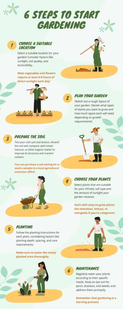
For my infographic alternative text, I would include the following:
An image of an infographic with a light green and yellow colour palette is presented.
6 Steps to Gardening
Step 1: Choose a Location
Alt Text: “Illustration of a person standing in a garden, assessing the sunlight, soil quality, and accessibility. They are holding a rake and looking ready to take action.”
Step 2: Plan your Garden
Alt Text: “Illustration of a person standing in front of garden beds, holding a tray of more plants and a garden hoe”
Step 3: Prepare the Soil
Alt Text: “Illustration of a person in a straw hat with a shovel staring at the hole they dug in the ground.”
Step 4: Choose your plants
Alt Text: “Illustration of a person with a wheelbarrow full of plants”
Step 5: Planting
Alt Text: “illustration of a person holding a bag of plant seeds and tossing some of them into the hole on the ground.”
Step 6: Maintenance
Alt Text: “illustration of a person holding a hose and watering plants blooming on the ground.”
Graphic design is inherently visual – what additions or modifications could you make to ensure that learners with visual impairments have access to the same information in an infographic in an online setting?
Ensuring learners with visual impairments have access to the same information in an infographic in an online setting requires careful consideration and the implementation of accessible design practices. Some modifications we can make include providing concise and descriptive alt text for all images and graphics used in the infographic. Screen readers can read this text aloud, allowing learners with visual impairments to understand the content. Also, for physical access, incorporate sensory feedback into the design, such as tactile graphics or braille labels. Tactile graphics can be added alongside digital infographics to provide a tactile representation for learners who are blind or visually impaired. Other aspects include accessible color choices, clear and readable choices, and audio descriptions. By implementing these additions and modifications, you can make infographics accessible to learners with visual impairments, ensuring they have equal access to information online. This aligns with Universal Design for Learning principles and promotes inclusivity in online education.
References
Mayer’s 12 Principles of Multimedia Learning. (2023, June 2). Digital Learning Institute. https://www.digitallearninginstitute.com/blog/mayers-principles-multimedia-learning/
Comments on Learning Pods Posts:
Hi Addi! I loved reading your Module 2 post! I had the same thought about the WAVE report, it is so easy to miss small details, but they can make a huge impact on learning. I also tried the Snoop Dog voice and found it distracting. But as you mentioned, it could be useful to another learner. I also agree with you that captions are a wonderful example of how accessibility is used by a wide variety of people with and without disabilities. Accessibility measures should be taken at every opportunity as to enhance the learning experience for all. I also had the same thoughts about the World Worst PowerPoint Presentations. They are full of clutter, inconsistency, and lack of Mayer’s Principles.
Additionally, I love your infographic. I didn’t think about how templates may impact creativity. That is a very good point. I think they are good for when you are just starting out as they create a good starting point, but they can create a very narrow image of what the infographic should look like. I can see that you used the segmenting principle by having the topic ordered into a step-by-step process. The spatial contiguity principle was well used as you had images right beside the corresponding text. Additionally, as per the coherence principle, the infographic had just enough information and was not crowded. Lastly, your alternative text was extremely detailed, I am impressed.
I also never heard about tactile graphics, thank you for sharing. I was able to learn something new today because of you!
Thank you for sharing Addi,
Maya
Hi Addi,
I wanted to express my appreciation for your insights on Module 2. I find your commitment to combining accessibility with creativity truly admirable and impressive. Your perspective highlights the importance of seamlessly integrating these elements.
Reviewing everyone’s experiences with the WAVE evaluation tool was eye-opening. It clearly demonstrated how even minor and unintentional design flaws can significantly impact accessibility. I was personally surprised by the issues identified in my report, but I’m impressed by how proactive and adaptable it is to prioritize making changes based on this valuable feedback.
I agree with your point about the importance of text-to-speech tools in enhancing accessibility, particularly in the context of inclusive design. These tools play a pivotal role in reducing accessibility gaps and ensuring a more equitable experience for all users. Your inclusion of equity in your definition of inclusive design resonates with me, as it reinforces the idea that inclusivity goes beyond access—it’s about fairness and equity.
Your observations regarding the “World’s Worst PowerPoint Presentations” are spot on. These presentations are rife with clutter, inconsistency, and a lack of adherence to Mayer’s Principles. It’s a great illustration of what not to do in multimedia design.
I found your mention of the potential trade-off between principles like alignment and contrast and creative freedom quite interesting. It underscores the importance of striking a balance—applying these principles when they enhance usability without compromising the creative essence of a project.
Lastly, I was thoroughly impressed with your layout for the “6 Steps to Gardening.” It was clear, easy to follow, and introduced me to the concept of tactile graphics and braille labels, which I’m eager to explore in future projects.
Thank you for sharing your valuable insights and experiences from Module 2. It’s been an enriching read!
Nicole